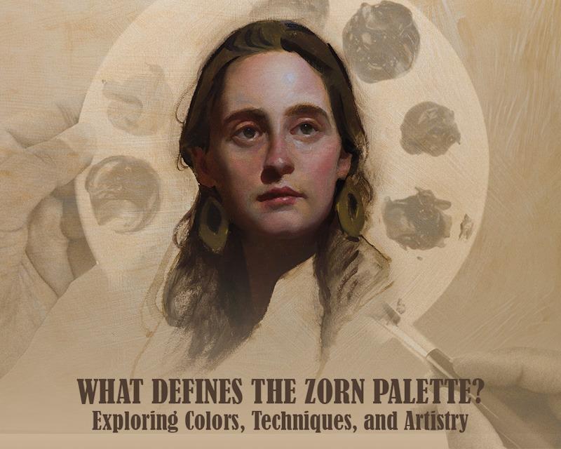
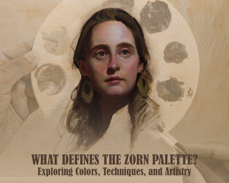
What Defines the Zorn Palette? Exploring Colors, Techniques, and Artistry
Raj Salunkhe
Last Updated on 15 April, 2024 |
I. Introduction to the Zorn Palette
Zorn Palette is a set of four colors attributed to the Swedish artist Anders Zorn (1860 - 1920). Four colors are Yellow ochre, Ivory black, Vermillion, and lead white. The Zorn palette is called the “limited palette” or “four-color palette.” Nowadays, modern artists have replaced cadmium red light with vermillion and titanium white with lead white due to toxicity concerns, but mainly because these two pigments are not readily available.

II. The Colors of the Zorn Palette
Zorn Palette Colors: Decoding the Basics
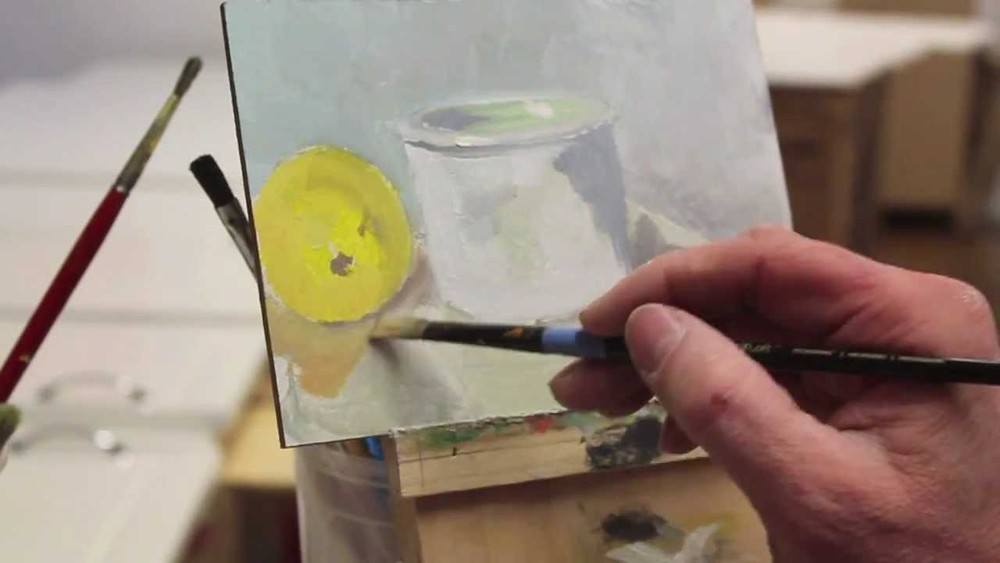
Zorn palette is made of four different colors. The Zorn palette is suitable for skin tones and flesh tones. Artists can adjust the ratios of the color. To get a wide range of colors. Cadmium Red, Yellow Ochre, Ivory Black, and titanium white are the colors of the Zorn palette. Anders Zorn was the Swedish painter behind this Zorn palette. He had a realistic yet loose painting style. By using only this amount of colors, he created a remarkable range of hues with incredible depth and realism.
- White, black: Used for changes in value. Ivory black is an excellent black that can be used as a substitute for blue.
- Yellow ochre, cadmium red, ivory black: These primary colors can be used later to make different hues.
Zorn Palette Color Wheel

This is a limited color palette. This palette typically consists of four colors, which you can read below -
- Cadmium red: This red is the primary red in the palette and is used for different warm tones in the painting, such as skin tones.
- Ivory black: Ivory black creates shadows and darker hues in the painting. It can be mixed with other colors to create a range of other deeper shades.
- Titanium white: This hue is used to create highlights and adjust the tones of the portrait or painting.
- Yellow Ochre: This yellow color provides a base for subtle skin tones and is often used for creating warm highlights and mid-tones.
This palette is limited in colors, but one can make remarkable painting pieces if one can use it skillfully. This color palette is effective for portrait painting because it simplifies the color choices and helps artists focus on value and temperature relationships in the portrait’s skin. The Zorn palette remains a valuable reference point for artists.
III. Applications of the Zorn Palette

Zorn Palette Painting: Techniques and Tips
You must have understood the Zorn palette, and now it’s time to know how you make splendid paintings. With the Zorn palette, you must understand some tips and techniques to paint and make masterpieces flawlessly.
- The Zorn palette benefits more from painting directly on a white background. The white color gives more vibrancy.
- Take out ivory black, squeeze out ivory black, titanium white, cadmium red, and yellow ochre, the Zorn palette of limited colors.
- Take a tonal value scale pack at the top of your palette with varying degrees of black and white. Start with pure white color, and create several steps of increasingly darker grey until you end the value with pure black.
- Mix some black with cadmium red and a little yellow ochre to create a warm brown.
- You can also mix a medium of stand oil & genuine turps to improve the paint flow.
- For flesh tone, create some warm and cool mixes on your palette.
- With the large filbert brush block in the basic shadow shapes of the head in a broad.
- You can make a violet color by mixing a little red and a little black.
- Add a warm, creamy color with white and a little yellow ochre to create a light tint.
- If you are creating thinner-skinned, bonier parts of the head, remember that they are more excellent areas; you must add a blue/green mix.
- You can use warmer tones such as red/yellows for fleshier parts.
- You should mix olive green with black and ivory black for the more excellent face areas, for example - under the eyebrows and the eye sockets.
IV. Extended and Adapted Zorn Palettes
Extended Zorn Palette: Beyond the Basics
Popularized by artist Ander Zorn, this palette typically consists of a limited set of colors: ivory black, vermillion (cadmium red), titanium white, and yellow ochre. If any artist mixes all these colors, it is possible to create a wide range of hues.
Extending the Zorn palette might involve an additional few colors, such as cobalt blue for various greens and blue hues. Raw color mixed of umber or burnt sienna can also be included to adjust the warmth and brown shades. By mixing all these colors, artists can achieve the spectrum and achieve more subtle distinctions.
Adapting the Zorn palette can include substituting colors within the limited variety to achieve different forms. For example, change vermillion with a different red, like crimson or cadmium red light; this way, you can alter the painting's overall color variety and temperature.
Various artists experimented with the Zorn palette, such as -
Morgan Weistling
He uses a few additional colors, like burnt sienna and ultramarine blue. He adapts this palette to create harmonized and detailed figurative works, adding more versatility while recruiting the spirit of the minimal palette.

Richard Schmid
He is known for using a more expanded limited palette; Schmid’s approach includes a broader range of colors while maintaining the principles of limited mixing. He added colors such as greens, blues, and some more reds.

Nathan Fowkes
Fowkes is renowned for his vibrant and colorful paintings. He often used a limited palette but expanded it with more saturated and varied hues, deviating from traditional limited palettes to create dynamic compositions.

Zorn Palette for Different Mediums
In this part of the blog, you will familiarise yourself with how Zorn palettes are used in different painting mediums.
Oil painting
The Zorn palette is most commonly associated with oil painting. Its limited colors are great for creating paintings and other subjects due to its ability to create a wide range of hues through mixing. Artists can manipulate the consistency of oil paints and blend them smoothly, which allows for subtle vibrations.

Gouache painting
Gouache can adapt quickly to the Zorn palette. Artists may use colors like yellow ochre, cadmium red, titanium white, and ivory black. Gouache allows for layering and reactivation. Artists can build up opaque layers and achieve a wide range by adjusting water-to-paint ratios.

Watercolor painting
Watercolor artists can mimic the Zorn palette by mixing burnt sienna, cadmium red light, lamp black, and Chinese white. However, watercolor tends to be transparent, making it challenging to paint. Layering and glazing techniques are crucial to achieve the desired depth and color variation.

Digital painting
Artists can use software tools to limit their color choices in digital painting. The advantage here is the ease of adjusting color opacity and layering without the drying time constraints of traditional mediums.

Using the Zorn palette for different mediums involves understanding each medium's unique properties and behaviors.
V. Creating with the Zorn Palette
Zorn Palette Color Chart: A Practical Guide
Creating a personalized color chart for the Zorn palette involves selecting specific colors that align with the traditionally limited palette used by Swedish artist Anders Zorn.

-
Adjust the intensity
You should choose an alternative red or yellow ochre with varying intensity levels if you want a more silent or intense version of a color.
-
Organize your palette
You should always organize your palette, maintaining the tone of your palette, such as going from warm to calm.
-
Add supplementary colors
You may expand the Zorn palette even though it typically consists of 4 colors. You can add colors like burnt sienna, raw umber, or ultramarine blue.
-
Creating a color chart
Prepare a canvas or a piece of paper to create a color chart. Leave enough space to mix each color as per your choice.
-
Label and mark
Label each section with a color name and mark any specific mix you make during your observations.
-
Test those colors
Use your version of the Zorn palette while you do your painting sessions. Test which color needs to be mixed more or less.
To engage yourself more with such a limited color palette, you can engage in deliberate exercises and practices that focus on understanding the nuances and possibilities of each color. Here are some suggestions for you all -
-
Mixing exercise
Create portraits using only the limited palette options of the Zorn palette. Thus, you can explore how to make combinations to complete a picture. You can spend time working with each color individually in monochromatic studies. This is how you can understand the range of values and temperatures each color can achieve.
-
Limited color challenges
Challenge yourself to paint the entire artwork using only the typical Zorn palette. This forces you to get creative with color mixing and explore the full potential of each color.
-
Color gradations
Create a color chart that shows gradual transitions between each color in your palette. This will help you to see how smoothly you can shift from one color to another. Explore warm and cool colors to change shifts in your painting.
-
Personal color recipe book creation
Keep a record of successful color mixtures you discover during your painting sessions. This can serve as a personal reference for future projects.
-
Understand color bias
You must understand the specific characteristics and biases of the pigments in your chosen colors. Understanding the warmth or coolness of a color helps in precise color mixing.
-
Experiment with limited colors
You have to experiment with a limited amount of hues only. Try to practice mixing and creating colors as per your choice. This way, your color mixing skills will increase as per your needs.
-
Attend workshops
Participating in workshops or classes focusing on limited color palettes will increase your knowledge. You might have some need for knowledge regarding color mixing, but by practicing under experienced artists, those dots will also join.
By engaging yourself with all these exercises, you can develop your artistic skills more deeply. Over time, you’ll become more intuitive in color choice and hue-mixing skills.
Also read: How to Paint a Portrait in Oil: A Quick guide for Beginners
Basic Zorn Limited Palette: Embracing Constraints
Working with a limited color palette is a concept deeply rooted in various artistic philosophies and has been embraced by many artists throughout history.
Simplicity & focus
By reducing the number of colors, artists can focus more on the essential element of their work, whether form, composition, or emotional expression, encouraging simplicity and focus toward your work.
Increased creativity
A limited color palette can increase creativity. Artists are forced to find innovative ways to express themselves within these hardships.
Versatility
Limited color palettes are often chosen for their versatility. A well-selected set of colors can be manipulated to create a wide range of tones and hues, allowing artists to convey various moods and atmospheres.
Skill emphasis
Working with a limited color palette increases artists’s skill to create more color mixes, thus increasing their artistic skills.
Naturalistic representation
Some limited palettes aim to mimic the limited range of colors found in natural scenes. This approach is particularly evident in landscape paintings, where artists reduce the set of colors to capture the essence of a specific time of day or atmosphere.
Economic considerations
Throughout history, artists often had to work with available limited sets of colors, and choosing a limited color palette was only practical. Artists became adept at maximizing the expressive potential of a restricted range of colors.
Advantages & disadvantages of the Zorn Palettes
Every artist should know the advantages and disadvantages of any medium or palette. In this part of the blog, you will understand the advantages and disadvantages of the Zorn palettes.
Advantages
- The limited palette helps artists balance dark and light, transparent to opaque, or warm and excellent in their painting. Balanced paintings are more satisfying to the eye and create more visual interest in the viewer.
- Due to the limited color palette, there is a lesser risk of having muddy colors mixes.
- The Zorn palette can create subtle, nuanced flesh tones, which helps generate realism and still lifes.
- The Zorn palette gives a more prominent aspect of colors with just four colors than you expect. The tonal range of colors allows subtle but effective shifts in temperature and value.
Disadvantages
- The Zorn palette has no shade of blue, which can be intimidating for many artists. If they want to make blue, the closest shades are cool gray, which can be achieved by mixing ivory black and titanium white.
- The palette is only partially suitable for a wide range of paintings, such as landscapes, but one can use it for still lifes and portrait painting.
VI. Frequently Asked Questions (FAQs)
How does the Zorn palette work?
Zorn palette limits color choices but still allows a wide range of hues mixed with four typical Zorn palette colors.
Which colors are in the Zorn palette?
The Zorn palette has four colors: Cadmium red, yellow ochre, Titanium white, and ivory black.
What are the Zorn skin tones?
Yellow ochre, crimson red, titanium white. These colors can be used mindfully to create flesh tones.
Is the Apelles palette the same as the Zorn palette?
The Apelles palette and Zorn Palette are both the same.
VII. Conclusion
Zorn palette is an exciting and great path to include in your artistic journey. As a beginner or even a professional artist, Zorn palettes are a great way to go with your artistic journey. You can make stunning paintings with this. With a restricted palette using canvas panels, you can even use excess paint such as cool black flake white on any painting surface. Most acclaimed portrait painters also used actual palettes with colored pencils.
Poster from Picture: 5 Tools for Crafting Stunning Posters from Photos
What Defines the Zorn Palette? Exploring Colors, Techniques, and Artistry
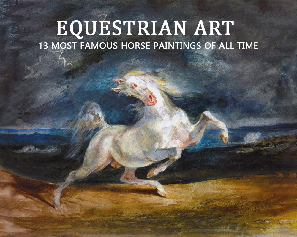
Equestrian Art: 13 Most Famous Horse Paintings of All Time
NFT Art Creation Guide: How to Make and Create NFT Artwork
Sketching vs drawing: what are the major differences?
What Are the 5 Basic Skills of Drawing? Let’s Master!
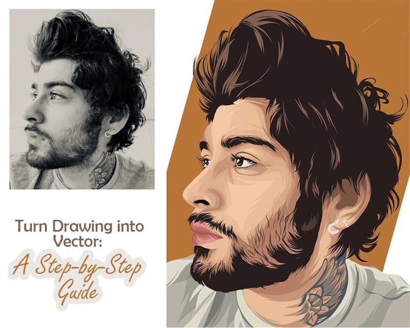
Turn Drawing into Vector: A Step-by-Step Guide
Cheap vs Expensive acrylic paint : Which One Should You Buy?

How Do You Make a Family Portrait? 11 Tips For Great Family Portraits

Decoding Artistic Talent: Skill, Education, and Creativity

Couple Portraits: All The Basics You Need to Know
Self Portrait for Preschoolers: 20 Creative Project ideas for Kids
Exploring Watercolor Effects in Digital Art: A Comprehensive Guide
How to Improve Your Art Style: 5 Rules to Follow
How to Draw Faster: Techniques and Tips for Swift Sketching
Pastel Portraits: An In-depth Guide to Pastel Portrait
Watercolor House Painting: A quick guide for beginners
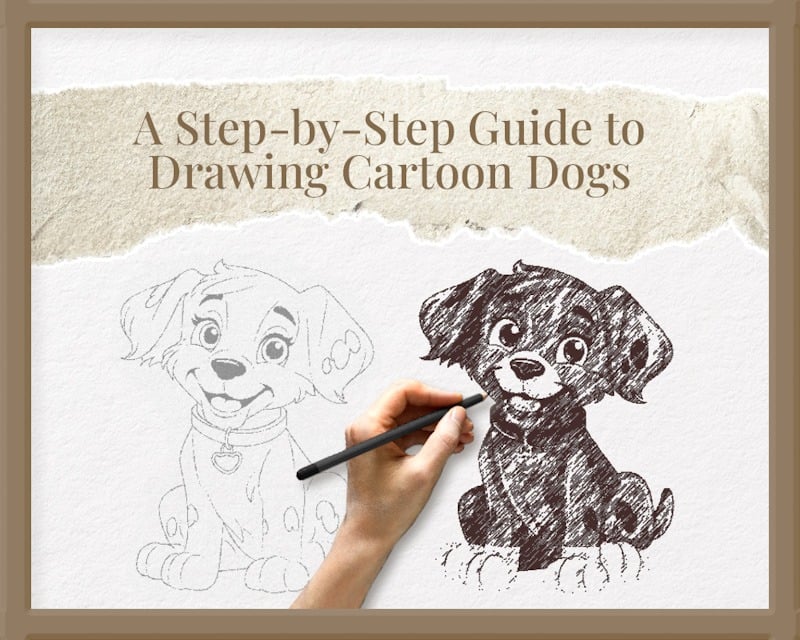
A Step-by-Step Guide to Drawing Cartoon Dogs
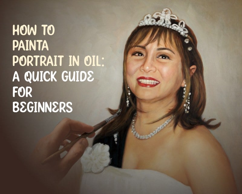
How to Paint a Portrait in Oil: A Quick guide for beginners

Turn Photos into Polaroids with Mobile Apps: Mastering the Vintage Look
Best Drawing Pencils for Artists: The Definitive Guide
Mastering the Art of Pencil Portraits: A Step-by-Step Guide
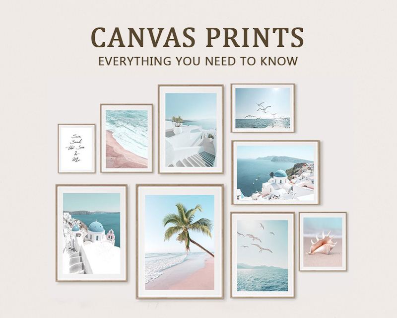
Canvas Prints: Everything You Need to Know
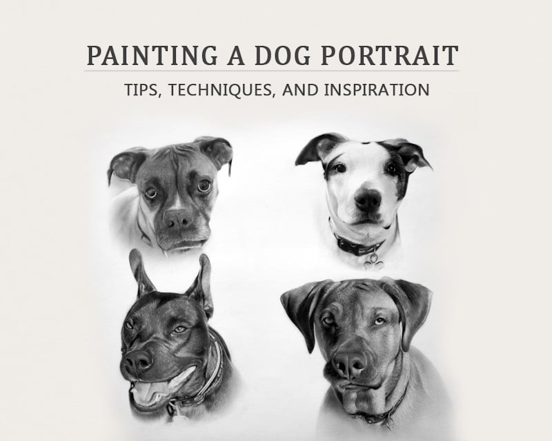
Painting a Dog Portrait: Tips, Techniques, and Inspiration
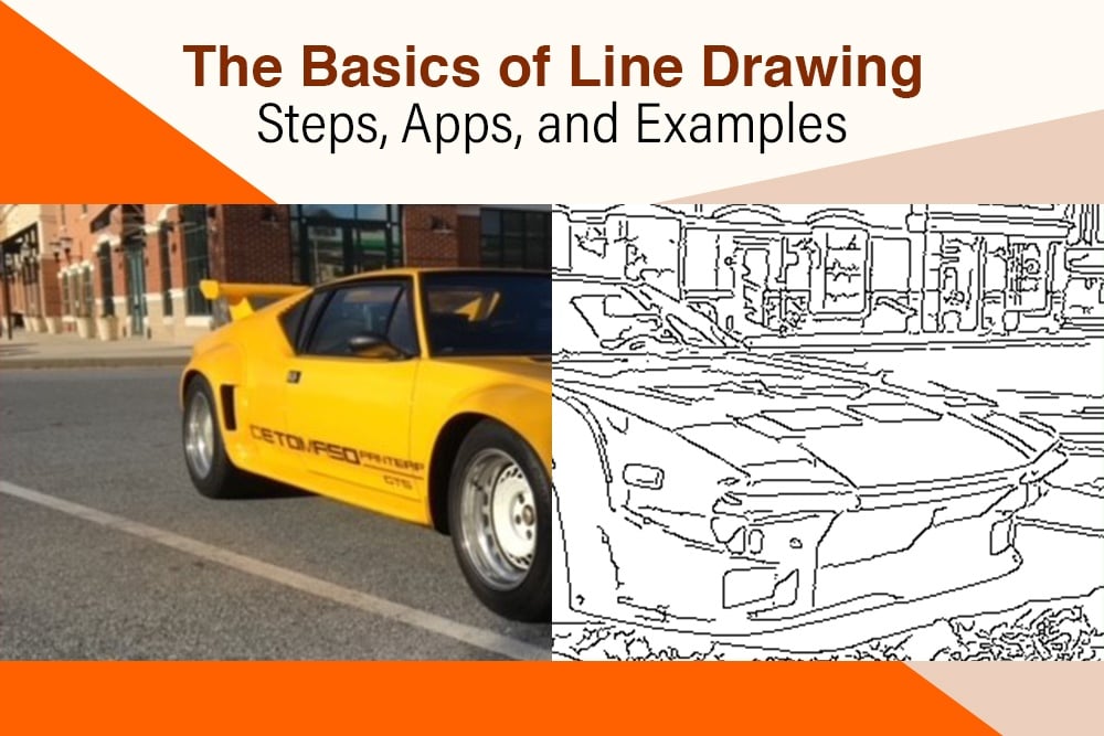
The Basics of Line Drawing: Steps, Apps, and Examples
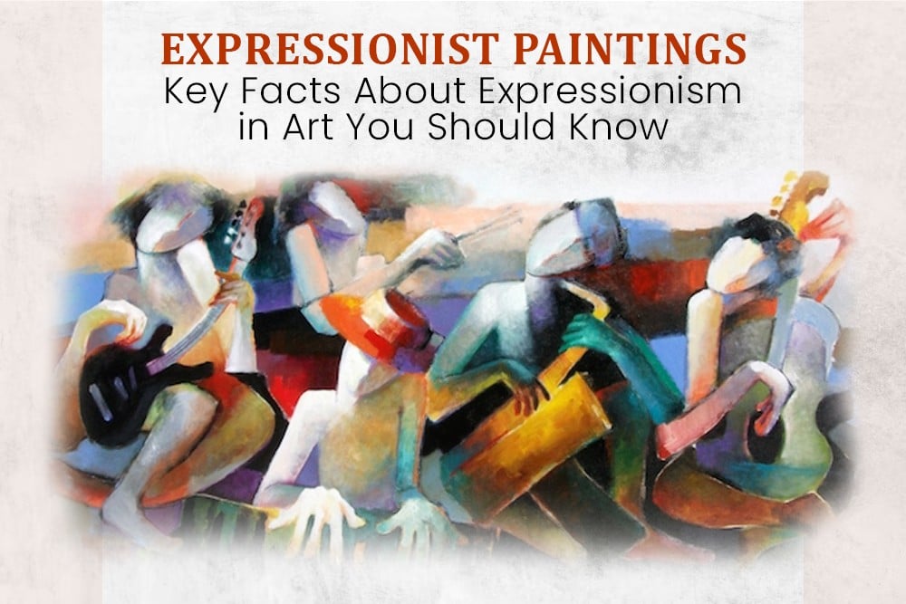
Expressionist Paintings: Key Facts About Expressionism in Art You Should Know

Famous And Professional Pet Portrait Artists Around The World
Cat Photography: 7 Tips for Taking Exceptional Cat Photographs

15 Heartfelt Pet Memorial Ideas to Honor Your Furry Friend

7 Reasons Why Custom Pet Portraits are the Best Gift for Pet Lovers

Convert Photo Into An Oil Painting: Top 7 Apps
Dog in Renaissance Paintings: 5 Key Facts to Know

What are Art Commissions? Important Facts About Commission Art and How it Works

Guide to Hiring Artists: Finding the Perfect Creative Talent for Your Project
Mastering Pencil Shading: A Comprehensive Guide to Shading Techniques
Canvas Painting: Techniques, Styles, and Preservation
Royal Portrait: History, Purpose, and Famous Paintings
Watercolor Portrait: Tips, Ideas, and Techniques to Follow
How To Paint Children’s Portraits in Watercolor? Top 10 Tips
Turn a Photo into Watercolor: Top 5 Apps
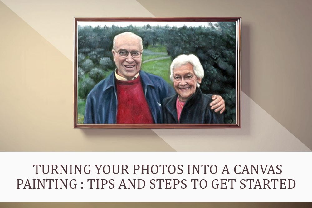
Turn Your Photos into a Canvas Painting: Tips and Steps to Get Started
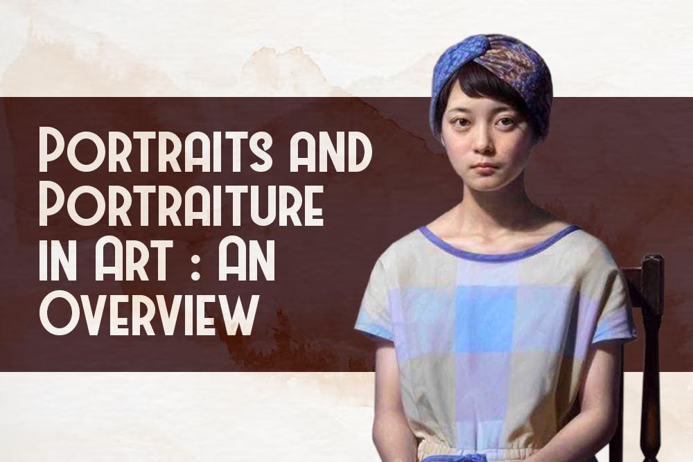
What are Portraits and Portraiture in Art: An Overview

Impressionist Paintings: Facts, Characteristics, and Examples
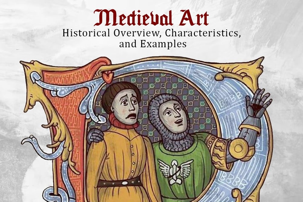
Medieval Art – Historical Overview, Characteristics and Examples

Memorial Painting: Everything You Need to Know About Memorial Paintings
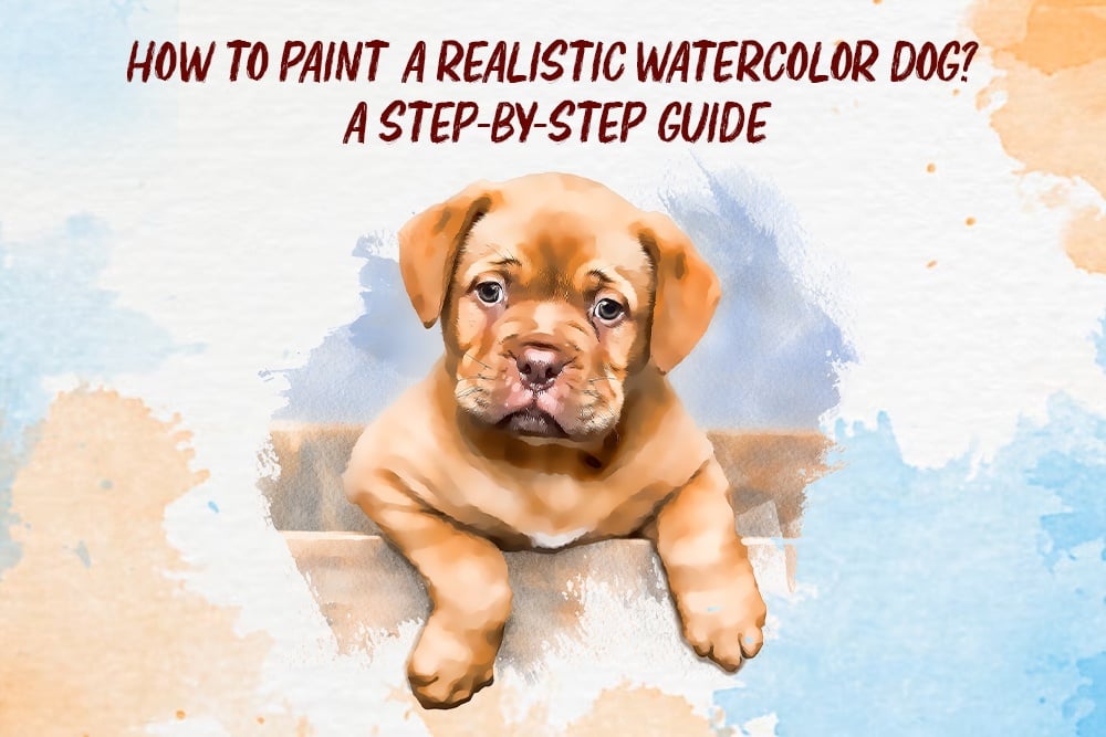
How to Paint a Realistic Watercolor Dog? A Step by Step Guide
How To Draw With Charcoal: Expert Tips
Renaissance Painting – Key Takeaways from the Renaissance Era of Art

Top 26 Customized Gifts for Pet Lovers (2023 updated)

How to Make Digital Pet Portraits? 3 Best Online Tools

How can I turn a Photo into Abstract Art? A Step-by-Step Guide
Charcoal Drawing Supplies: A detailed list

16 Websites That Offer Royalty-Free Drawings And Illustrations In 2024
Convert photo to digital art: An Easy Guide

Top 21 Most Expensive Paintings Ever Sold (2024 Updated)
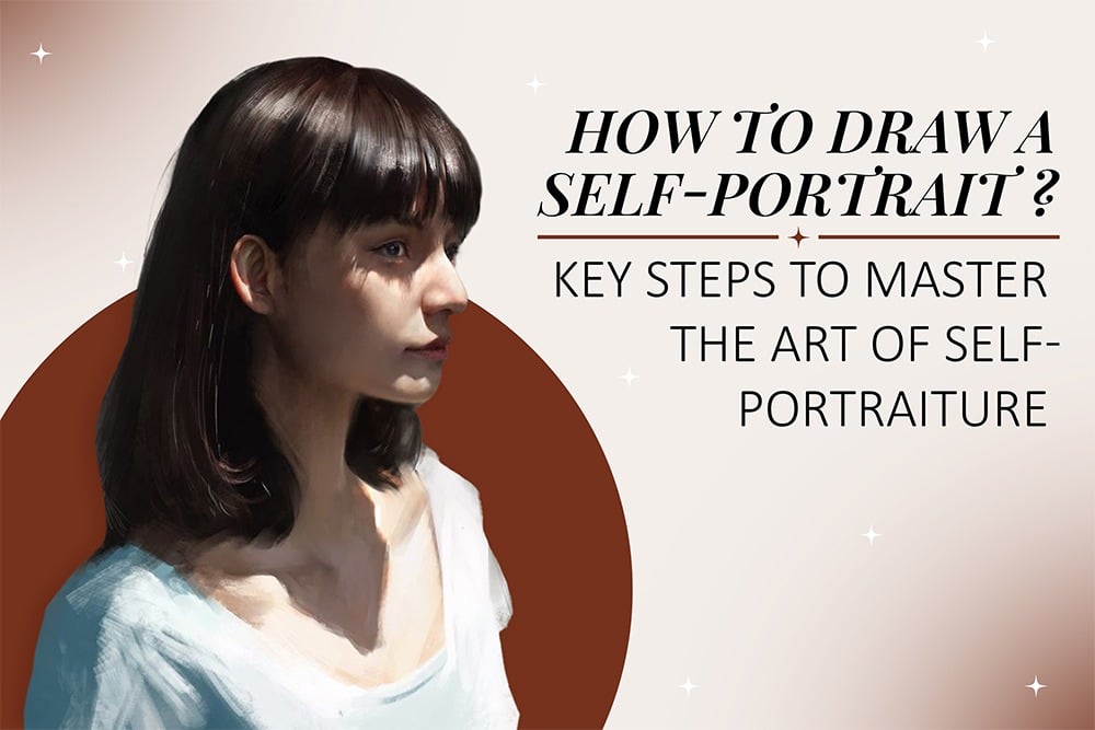
How To Draw A Self Portrait: Key Steps To Master Self-Portraits

13 Pet Photography Tips for Great Pet Portraits
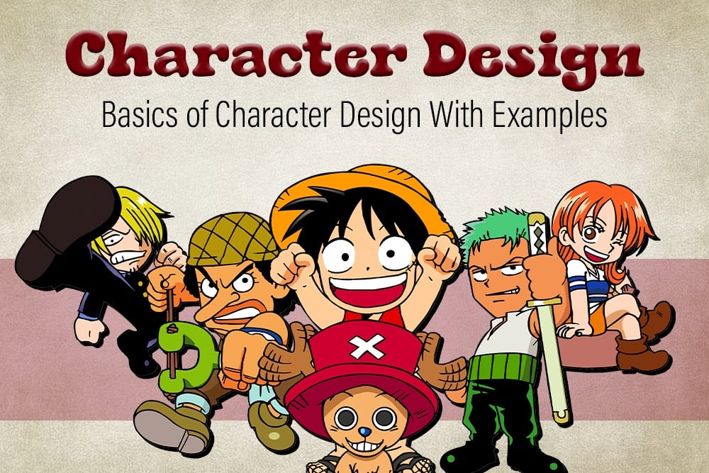
Character Design – Basics of Character Design with Examples

What is Portrait Painting? Everything you need to know about Portrait Painting
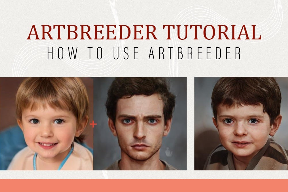
Artbreeder tutorial – How to use Artbreeder

16 Best Face Swap Apps in 2023

What makes a painting valuable? Value in art explained
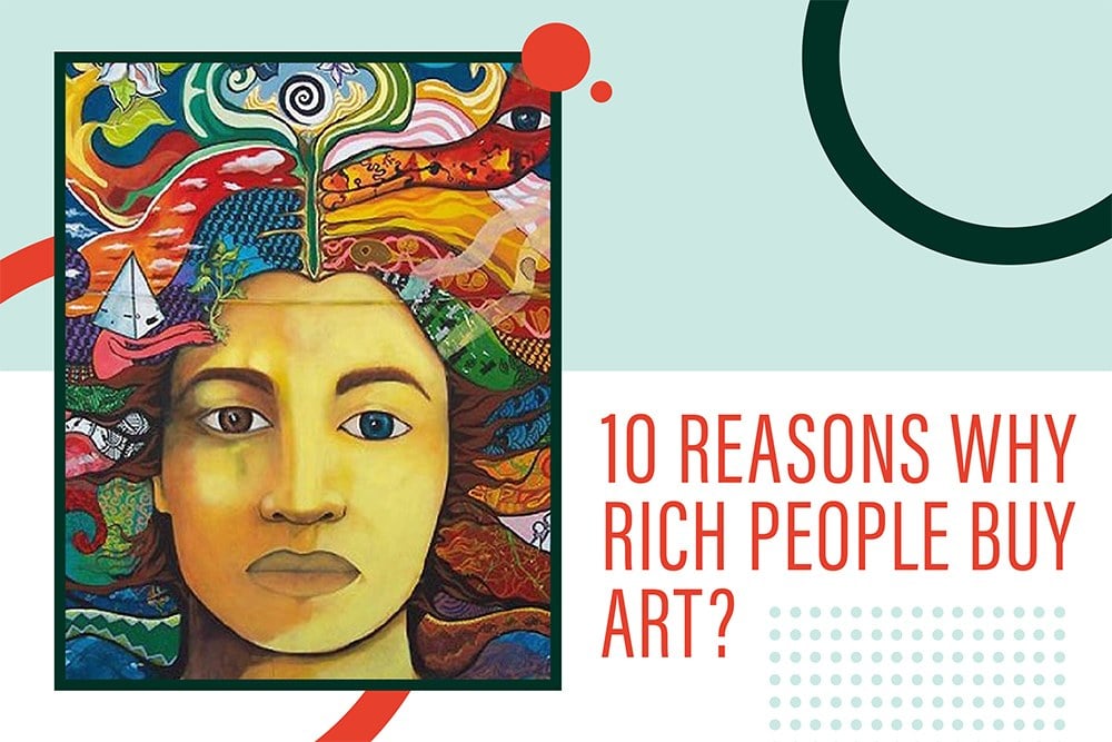
Why do rich people buy art? Top 10 reasons

Sketch Artists : Career Prospects, Education and Job outlook
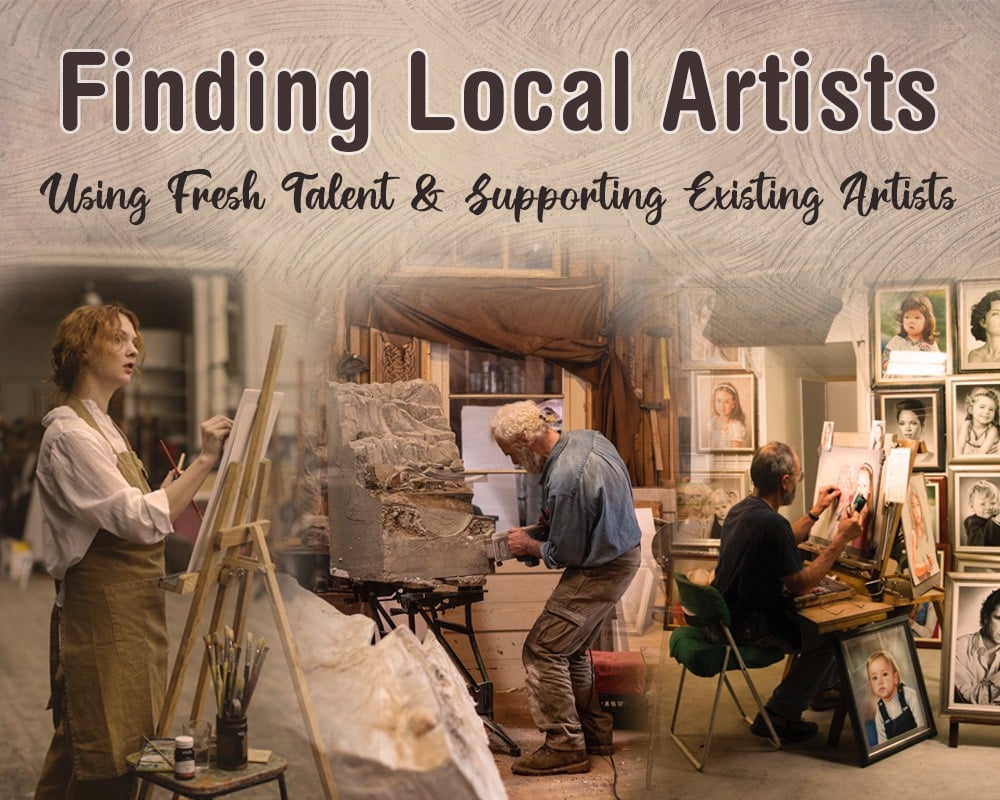
Finding local artists: Using Fresh Talent & Supporting Existing Artists
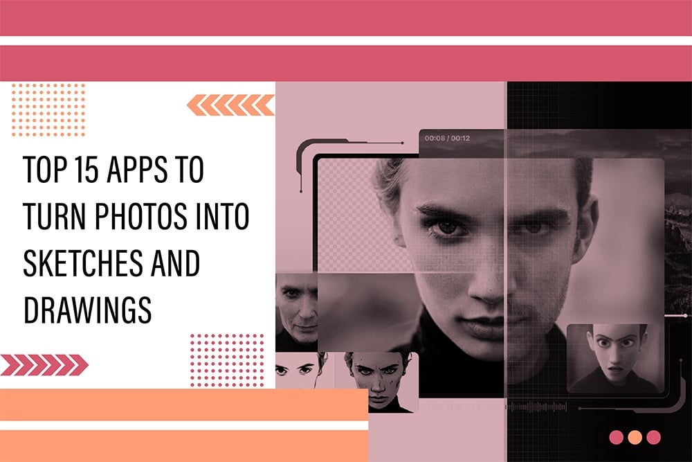
Top 15 apps to turn Photos into sketches and drawing
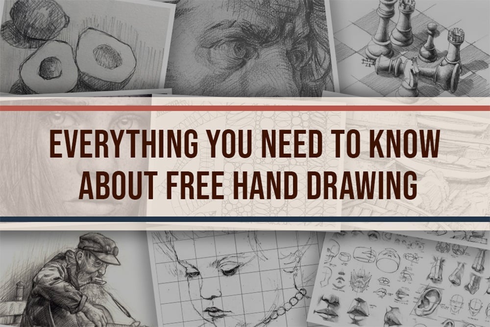
Everything You Need to Know About Free hand drawing
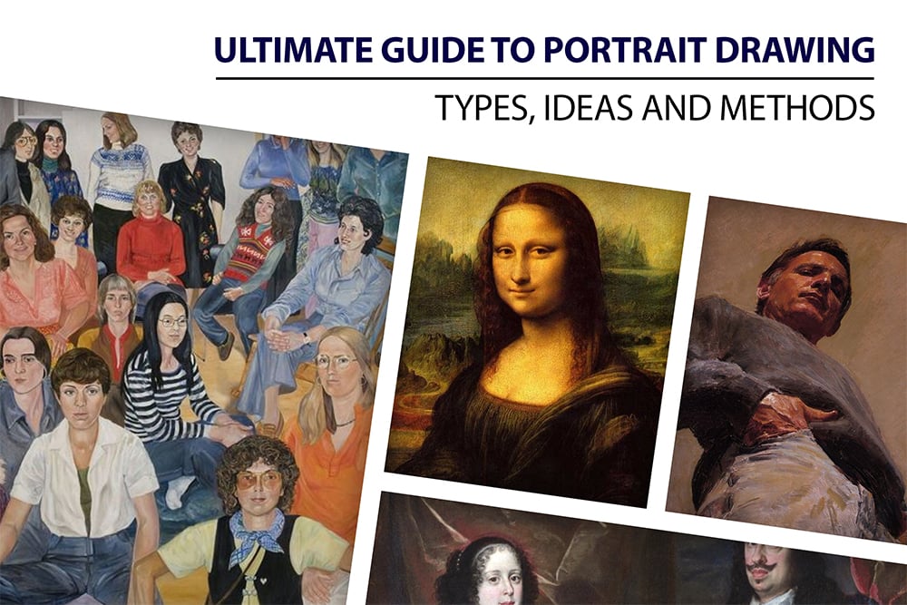
The Ultimate Guide to portrait drawing – Types, Ideas and methods
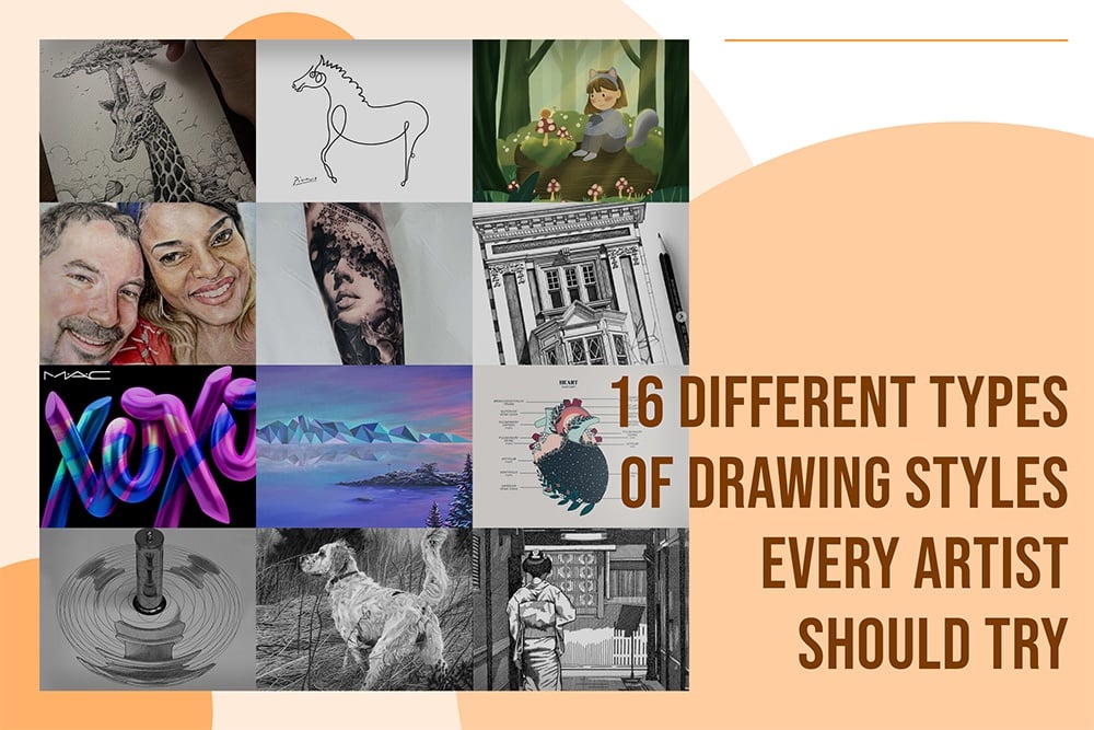
16 Different Types Of Drawing Styles Every Artist Should Try
Top 10 Tips for DIY Photography
Caricature: The Humorous Art that Captures Us All
Top 100 Art Blogs To Do follow
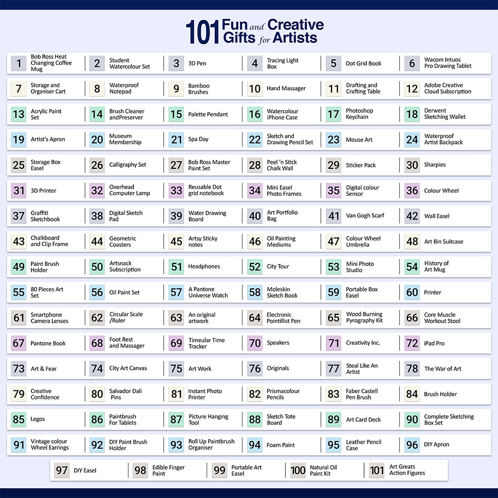
101 Fun and Creative Gifts For Artists
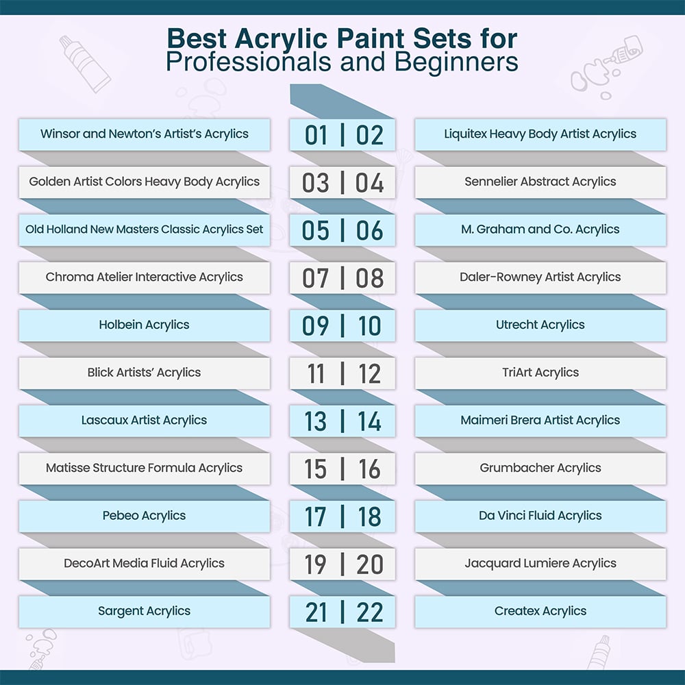
Best Acrylic Paint Sets for Professionals and Beginners

How To Sketch: 20 Essential Sketching Tips For Beginners
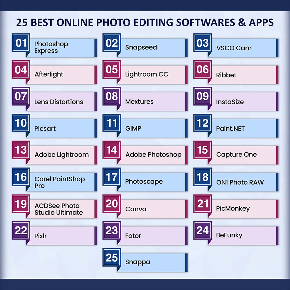
25 Best Apps & Software for Photo Editing
200+ Drawing Ideas That Are Easy and Beginner friendly
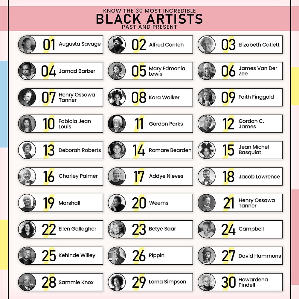
Know The 30 Most Incredible Black Artists: Past and Present

100 Best Art Schools in US
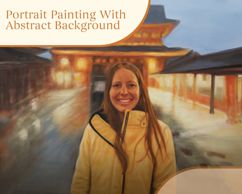
Portrait Painting With Abstract Background
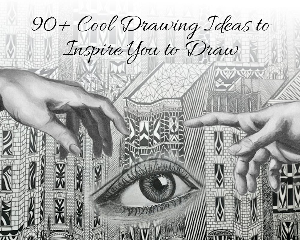
90+ Cool Drawing Ideas to Inspire You to Draw
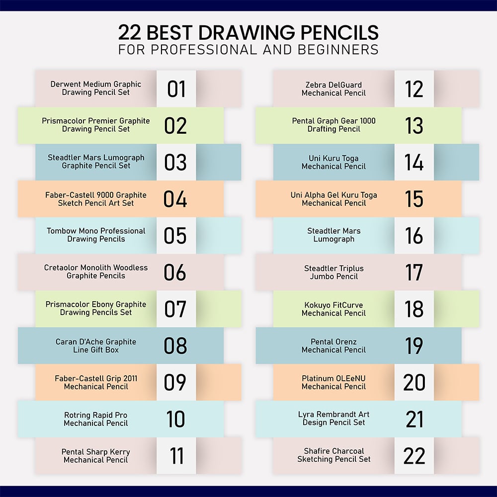
22 Best Drawing pencils for Professionals and Beginners
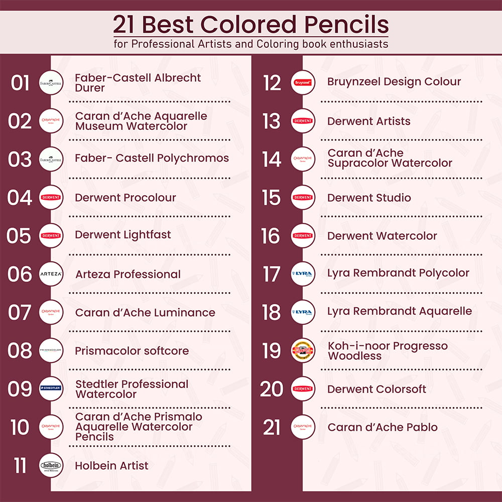
21 Best Colored Pencils for Artists
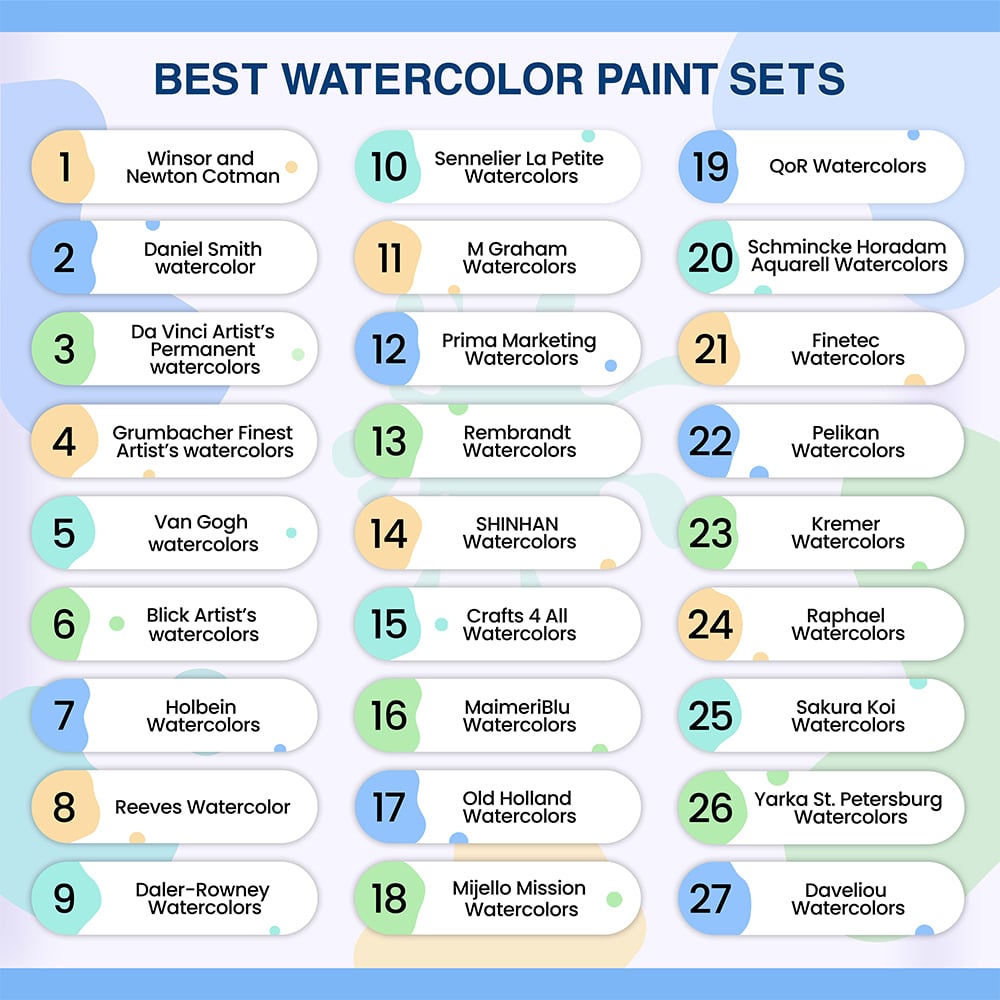
27 Best Watercolor Paints that every Artist will Love

How We Created A Family Portrait From Multiple Pictures
How We Created A Pet Portrait With A Neutral Background
26 Best Drawing Tutorials Online – Learn How To Draw
30 Best Dating Apps To Look Out For In 2023

Christmas Gift Ideas for Men In 2023

24 Health Benefits of Drawing, Painting And Art
Step up the fun this summer with Squirt Gun Painting

Why You Should Invest In A Hand Made Portrait

How To Hire A Caricaturist
The Best Ways to Turn Photo into Painting
Make a Photo into a Painting for Relieving Memories
How to Find the Best Professional Artists for Converting Photos to Paintings

5 Important Things You Need to Know About Picture to Paint Conversion
4 Tips for Photographing Your Pets
Top Tips for Choosing a Photographer for Your Destination Wedding
How to Make a Homemade Light Tent
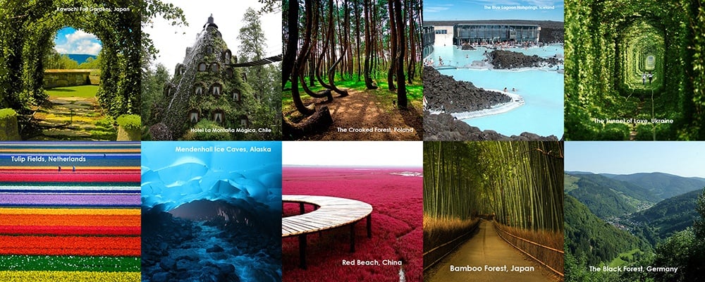
10 Most Stunning Places on Earth – Take Your Camera!
5 Creative Things to Do With Old Family Pictures
Show Support for Project Semicolon, Amy Bleuel with a Caricature